

Custom Home Builder Signs: A Practical Guide for 2026
Most advice on custom home builder signs is too shallow. It fixates on colours, logos, and whether the phone number should be bigger, then skips the parts that create problems on site: council rules, wind load, poor placement, and the simple question every builder should ask before ordering anything, will this sign pull its weight?
A builder sign isn't just a branding panel you bolt into the dirt because “that's what builders do”. It's a working site asset. It has to identify the project, represent the business properly, survive weather, stay compliant, and help turn local attention into enquiries. If it can't do those jobs, it's clutter.
That matters in Australia because signage sits inside a live housing pipeline. The Australian Bureau of Statistics reports that new residential building approvals remain in the hundreds of thousands annually through the underlying residential approvals flow covered in this reference. For builders, that means signs aren't tied to rare opportunities. They're part of a steady stream of active sites, renovations, knockdown rebuilds, infill jobs, and custom homes where local visibility still counts.
The practical conversation is broader than design. You need to decide what the sign is for, what material suits the site, whether council approval is needed, how it will be installed, and how you'll judge if it worked. That's where most generic articles fall short. They tell you how to make a sign look nice. They don't tell you how to stop it becoming an expensive, non-compliant panel that no one can read from the road.
Your First Salesperson On Site The Power of a Great Sign
If you still treat custom home builder signs as a grudging line item, you're leaving value on the table. On most jobs, the sign is the first physical expression of the build. It shows up before the finished façade, before the landscaping, and well before the client starts talking about the result with their friends.
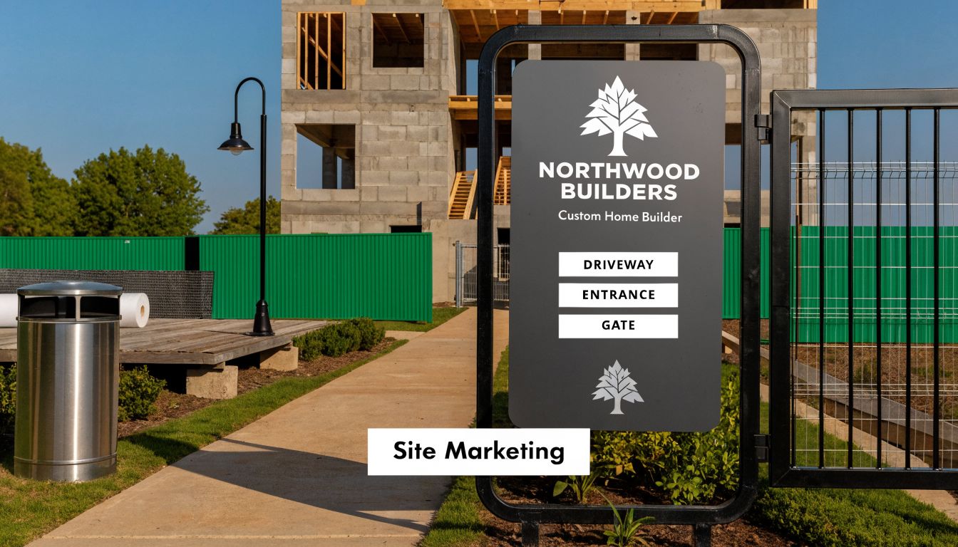
A strong sign does three things at once. It marks the site, signals professionalism, and gives the neighbourhood a name to remember. That last point matters more than many builders admit. People often notice a project long before they're ready to call anyone. If the sign is clear, tidy, and easy to recall, your brand stays with them.
Why site signs still matter
The common throwaway line is that “everyone finds builders online now”. That's only partly true. People still drive past jobs, watch progress, and judge builders by what they see on active sites. A sign catches buyers, neighbours, investors, and referral partners in the exact area where you want more work.
For boutique builders, that local relevance is hard to beat. A well-placed site sign can outperform generic advertising by targeting people already moving through the area, as noted in this discussion of how site signs help home builders market new communities.
Practical rule: If the site is visible and the sign is readable, the job is already marketing the next one.
What a weak sign tells people
Bad signs send a message too. A warped panel, faded print, cluttered copy, or crooked install suggests a builder who cuts corners or doesn't pay attention. That may be unfair, but that's how people read visual cues.
The strongest custom home builder signs don't try to say everything. They do the basic job properly:
- Identify the builder clearly: Name first. People need something they can remember.
- Show project confidence: The sign should feel deliberate, not temporary in the worst sense.
- Make contact simple: One website or one phone path is usually enough.
- Stay presentable for the full build: If the sign degrades halfway through the job, it stops helping.
There's also a timing advantage. On many residential sites, the sign is visible before much else happens. That early presence lets the builder build familiarity while the project is still taking shape, not just after the finished photos go live.
Developing Your Signage Blueprint Before You Design
The design brief for a sign should start with one question. What job is this sign doing on this site? If you can't answer that cleanly, the artwork will drift, the copy will bloat, and the finished sign will try to do five jobs badly.
Start with the primary outcome
A sign for a bespoke home in a premium suburb isn't doing the same work as a directional sign to a display location, or a temporary board on a renovation tucked behind fencing. Decide the main purpose before you call the sign writer.
Common roles include:
Brand recognition in a target suburb
This works when the site has decent exposure and the business wants repeated local visibility over the build period.Lead generation from pass-by traffic
This only works when the site, traffic flow, and message all line up. If people can't read it safely, don't expect calls.Wayfinding for inspections or display access
These signs need clarity over flair. Wrong turn, lost vehicle, frustrated visitor.Compliance and identification
Some signs are there because the site needs clear project identification or because stakeholders expect it. That doesn't mean they should be poorly considered.
Match the sign to the project type
A renovation sign can be smaller and more restrained if access is tight and neighbouring amenity is sensitive. A custom home on a corner allotment can carry more visual weight because it has more sightlines. A multi-dwelling or developer site often needs a system, not a single board.
If you're still sorting out scope and client priorities, the same thinking used in a proper design brief for a building project applies here. The clearer the brief, the fewer expensive revisions later.
A sign should be designed around the decision you want a passer-by to make. Notice the builder. Remember the builder. Call the builder. Follow the direction.
Set limits before the artwork starts
The easiest way to ruin a sign is to dump every service line onto it. “Custom homes, renovations, extensions, developments, fit-outs, project management, design, drafting” might all be true, but it's too much for a moving car.
Use a short filter before approving any copy:
- Must be there: Builder name, core identifier, direct contact path.
- Useful if space allows: A concise descriptor like custom homes or renovations.
- Usually unnecessary: Long capability lists, dense slogans, extra logos, multiple calls to action.
Good custom home builder signs are selective. They aren't trying to educate the whole market in one glance. They're trying to make the right local person pause mentally and think, “That's the builder on this job.”
Designing for Impact Materials and Messaging That Work
Design isn't decoration. On a builder sign, design is readability under imperfect conditions. Drivers are moving. Cars are parked where they shouldn't be. Trees grow into sightlines. Sun fades colour. Mud splashes the bottom edge. If the sign only works in a mock-up, it doesn't work.
Messaging that survives real roads
Most signs fail because builders ask them to carry too much information. The sign face needs a clear visual hierarchy. People should notice the builder name first, then the contact path, then any secondary message.
Keep the message stack simple:
- Top priority: Builder name or trading name
- Second priority: Website, phone, or tightly defined action
- Third priority: Short project descriptor if it helps
What should be cut? Paragraphs. Long slogans. Tiny social icons. Fancy script that looks premium on screen but disappears from the road.
If a neighbour standing across the street can't tell who built the project within a quick glance, the layout needs fixing.
Choosing the Right Sign Material
Material choice isn't glamorous, but it affects appearance, lifespan, maintenance, and whether the sign can be reused. Cheap material often looks cheap fastest.
| Material | Typical Cost | Durability | Best Use Case |
|---|---|---|---|
| Corflute | Lower-cost option | Lower durability in exposed conditions | Short-term signs, internal site notices, sheltered temporary use |
| Aluminium Composite Material (ACM) | Higher-cost option | Strong outdoor durability and better reuse potential | Premium builder signs, long-duration custom home sites, repeat deployment |
| Banner mesh | Varies by size and fixing method | Suitable where wind permeability matters, but depends on framing | Fencing, hoardings, temporary perimeter branding |
Corflute has its place. It's light, quick, and serviceable for short-term needs. But on exposed residential sites, it can bow, crack, fade, or tear around fixings. If the project will run for a long period, the replacement cycle becomes the hidden cost.
ACM is usually the more professional option for a main builder sign. It holds shape better, prints cleanly, and survives repeated use if it's stored properly between jobs. Banner mesh suits fences and hoardings where solid panels would catch too much wind or where the perimeter itself is the sign face.
What works better than a bigger logo
Builders often push for logo size because it feels like branding. The better move is contrast, spacing, and restraint. A moderate logo with clean negative space usually reads better than an oversized mark squeezed against busy text.
This is also where broader brand discipline helps. If you want a practical outside reference, this guide for remodelers to brand their business is useful because it frames branding as consistency and clarity, not just graphic style.
A few field-tested choices improve outcomes:
- High contrast colours: Dark text on a light field, or the reverse, tends to read better than subtle tonal combinations.
- Minimal copy blocks: Fewer words means larger type and stronger legibility.
- Strong edge finishing: A quality finish helps the sign look intentional after months outdoors.
- Reusable layout logic: If every job needs a fresh design from scratch, production gets messy and expensive.
The sign doesn't need to be clever. It needs to be obvious.
The Builder's Guide to Council Approvals in Australia
This is the part many articles skip, and it's the part that creates headaches. In Australia, a builder sign can be caught by local council rules, planning approval pathways, and road safety considerations, and those requirements vary by jurisdiction, as noted in this overview of building signs and approval considerations.
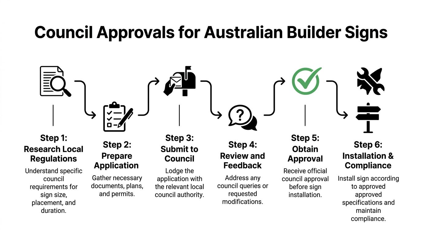
That variation is why generic advice like “just put up a temporary sign” is risky. Whether a sign is treated as site identification, advertising, or a potential traffic hazard can change how it's assessed. Builders who assume all temporary signs are exempt can come unstuck quickly.
Ask these questions before you order anything
A sign should be checked against the site, not just the artwork proof. Before fabrication, confirm the basics with the relevant council or planning team.
Use a checklist like this:
- Where exactly will it sit: On private land, near a boundary, on fencing, or close to the road reserve?
- How long will it stay up: Some rules are more relaxed for short-term use than longer display periods.
- Is it illuminated or not: Lighting changes the compliance conversation fast.
- Could it affect driver attention or sightlines: This matters near corners, driveways, and busy approaches.
- Does the zoning or local overlay change expectations: Residential character areas can be more sensitive.
For Adelaide projects and surrounding areas, a builder should also check whether the sign placement could overlap with development controls that sit outside the normal assumptions for temporary site signage. If the project itself is already moving through approvals, it makes sense to review sign issues at the same time as the broader planning pathway. A plain-English explainer on what a development application involves is useful context if the project team is still sorting where approvals begin and end.
Common compliance mistakes builders make
Most sign problems aren't dramatic. They're ordinary oversights that could have been avoided with one phone call and one site inspection.
The common ones are:
Ordering first, asking later
This is how builders end up with a sign size or location that isn't acceptable.Treating public land as a spare sign location
Nature strips, road verges, and public-facing corners aren't free space just because they're convenient.Ignoring sightlines
A sign can be visually tidy and still create problems if it interferes with safe entry and exit from the site.Using wording or presentation that looks more like advertising than identification
In some settings, that distinction matters.
On-site reminder: If a sign is close enough to matter for visibility, it may also be close enough to matter for compliance.
How to deal with councils without wasting time
Councils respond better when the builder is specific. Don't ask vague questions like “Can I put a sign up?” Ask with dimensions, material, location, and duration in mind. If possible, send a simple marked-up site sketch or photo.
Keep your internal process tight:
- Check the council website first: Look for temporary signage, advertising signs, planning rules, and road reserve policies.
- Call with the site details ready: Address, project type, proposed sign location, approximate size, and how long it will remain.
- Record the advice: Save the email, note the officer name, and keep it in the job file.
- Build to the approved intent: Don't improvise in the field because the site supervisor wants it “a bit more visible”.
This isn't legal advice, and every council handles signage a little differently. But the practical rule is simple. If there's any doubt, clarify it before the sign is printed and before the installer turns up.
From Print to Post Production and Installation Done Right
A good sign can still fail in production. Builders often lose money at this stage through poor print quality, weak hardware, rushed install work, or a supplier who understands graphics but not construction sites.
The technical benchmark is straightforward. A robust sign approach includes selecting substrate and hardware for outdoor durability and wind load, making sure text is legible at approach speed, and positioning the sign with road safety and driveway visibility in mind, as discussed in this piece on design thinking for homebuilder signage.
What to expect from a capable supplier
A proper sign supplier should ask practical questions, not just request your logo files. They should want to know site exposure, mounting method, expected duration, and whether the sign is likely to be reused.
A worthwhile production conversation covers:
- Substrate choice: Does the material suit the site exposure?
- Fixing method: Posts, frame, fence mount, wall mount, or hoarding attachment?
- Finishing details: Edge quality, lamination if needed, and how the print will age.
- Transport and handling: Large panels get damaged before installation more often than people admit.
If the supplier can't talk about wind exposure or installation constraints, they're only doing half the job.
Installation is where professionalism shows
The install should be square, stable, and thought through from the main approach roads. Builders often focus on the front-on view, but passing traffic usually sees the sign from an angle first.
A better install process looks like this:
- Stand at the likely driver approach and pedestrian approach.
- Check what blocks the sign at different heights. Parked cars, bins, fencing, vegetation.
- Confirm the sign doesn't compromise driveway visibility.
- Brace and foot the structure to suit the site conditions, not just the sign size.
A reusable system usually pays off over time. Many builders are better served by a durable standard sign package with replaceable project-specific overlays than by reinventing every panel.
Templeton Built is one example of a builder that works across renovations, extensions, bespoke homes, and development projects with an in-house design-and-build model, which is the kind of workflow where sign decisions can be planned earlier instead of being left to the last week before site start.
Keep the sign presentable for the full project
Once the sign is in, someone still needs to own it. Mud, damage, fading, and loose fixings don't fix themselves.
Put a quick sign check into your site routine:
- After storms: Check movement, tears, leaning posts, and fixings.
- After major deliveries: Trucks and plant often clip corners and braces.
- At key milestones: Make sure the sign still reflects the stage and still looks worth keeping up.
- Before handover: Decide whether to remove, replace, or leave a completion sign for a short period if allowed.
A sign that starts strong and then deteriorates works against the builder.
Turning Foot Traffic into Leads With Smart Signage
A sign that only “looks good” is hard to justify. A sign that feeds a lead funnel is much easier to defend. In practice, effective builder signage works best when it's paired with mobile landing pages or QR codes, tracked through calls and form fills, and supported by a small network of directional signs rather than one oversized panel, as outlined in this article on marketing strategy ideas for home builders.
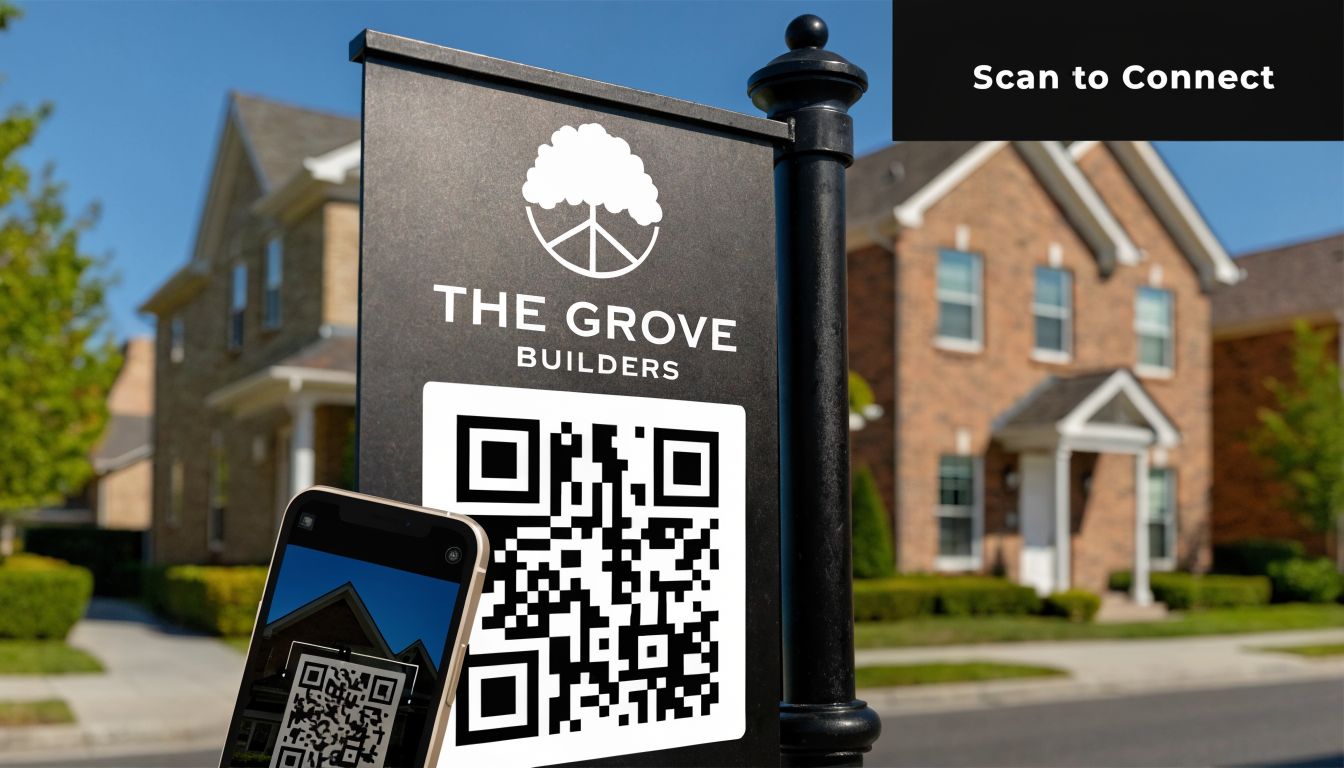
Make the sign lead somewhere specific
The biggest mistake with QR codes is linking them to a generic homepage. That wastes the moment. If someone scans from a sign outside an active project, they should land on something directly relevant.
Better destinations include:
- A project page: Current build photos, design intent, and a clean enquiry path
- A suburb-focused contact page: Useful if the builder wants local work in that area
- A renovation or custom homes page: Match the page to the project type
- A short form for inspection requests or consultations: Keep fields minimal on mobile
The same principle applies to phone tracking. If signage matters, give it a way to be measured. Use a dedicated phone path or a call tracking setup that separates sign-led enquiries from broader website traffic.
Signs work better as a system
One large sign at the site entry can miss half the audience. Traffic doesn't always approach from the direction you expect, and some sites disappear behind fencing, parked cars, or street trees.
A smarter layout often includes:
- Primary site sign: The main branded panel on the allotment
- Last-turn directional sign: Placed where a driver makes the final approach decision
- Feeder-road directional support: Useful where the site sits off a busier road or in a new estate
- Completion-stage branding: A tidy panel that captures attention when the project looks its best
That setup also improves visitor flow for clients, consultants, and trades. Less confusion means fewer calls asking where the site is.
Don't judge a sign by whether people compliment it. Judge it by whether the right people call, click, or arrive.
Measure what happened after installation
Most builders don't need complex reporting. They need a habit of checking whether the sign generated action.
Review practical signals each month:
- Call enquiries mentioning the site or street
- QR scans or mobile page visits linked to the sign
- Form fills tied to the project page
- Direction-related calls that suggest signage is or isn't clear
- Neighbour or pass-by enquiries during the build
If the sign is visible but underperforming, the issue is usually one of four things. The message is too broad, the contact path is weak, the placement is poor, or the landing page doesn't match what people expected.
Builders trying to tighten the full funnel can also benefit from broader lead generation strategies for builders that connect offline visibility with search, referrals, and project-specific enquiries.
For homeowners, the sign can also serve as a research shortcut. If someone sees a local project they like, they often want the next step to be simple. A page built around practical selection questions helps. Templeton Built's guide on questions to ask a custom home builder fits that kind of enquiry path well because it meets people at the point where they're comparing options.
There's also a timing element that many builders miss. The message on a sign doesn't have to stay frozen for the full project. Early-stage messaging can build awareness. Mid-build signage can drive direct enquiry. End-stage signage can capitalize on the finished result when the home looks its strongest. That's often when neighbours and passers-by pay closest attention.
A good sign doesn't replace digital marketing. It improves it by catching local attention and sending that interest somewhere measurable.
If you're planning a renovation, extension, custom home, or development project in Adelaide and want a builder who understands both the on-site realities and the approval process around residential construction, speak with Templeton Built. Their team handles design and construction across a wide range of project types, which makes early decisions about site presentation, approvals, and practical build communication easier to coordinate.


Leave a Reply