

10 Shop Renovation Ideas to Boost Your 2026 Sales
A lot of shop owners are standing in the same spot right now. Sales feel harder won than they should. Staff are working around the layout instead of with it. Customers walk in, hesitate, drift, and leave without ever reaching the products you most want them to see.
Your shop interior has to do more than hold stock. It has to sell, guide, reassure, and support the way people buy in 2026. If it doesn't, even a well-run store starts leaking value through poor flow, tired finishes, bad lighting, and awkward service points. That's why smart shop renovation ideas aren't just about making a space look newer. They're about aligning the fit-out with the outcome you want.
This matters across Australia because physical retail still operates at serious scale. The Australian Bureau of Statistics reported 349,685 retail businesses operating in Australia in June 2024. A shop refresh isn't a niche decision. It sits inside a large, active trading environment where layout and customer experience still matter every day.
If you're also thinking beyond the tenancy itself, some of the same principles that lift store performance also support broader ways to increase property value.
1. Create Experiential Retail Zones
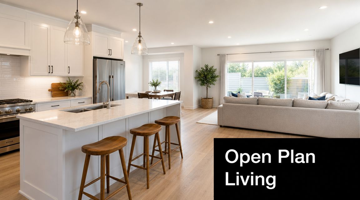
A shop that only displays products is easy to replace online. A shop that gives people a reason to stay has a better chance of winning the visit.
Experiential zones work best when they're small, deliberate, and tied to how customers already buy. In a beauty store, that might be a consultation bench with a mirror and task lighting. In a homewares shop, it could be a styling table where staff build room sets. In apparel, it may be a personalisation station or a fitting lounge that feels more private than the rest of the floor.
What works on real projects
The mistake I see most often is overbuilding the experience area and starving the sales floor. You don't need a giant event space. You need a zone that can flex between demonstration, consultation, and feature display without becoming dead floor area on quiet weekdays.
A practical setup usually includes movable fixtures, concealed power, lockable storage, and lighting that can shift from general trading to focused task use. That same thinking shows up in good office renovation planning, where multipurpose spaces perform better than single-use rooms.
Practical rule: If the zone can't earn its keep on a normal Tuesday, shrink it.
Short, staged works are usually the safest path. Build the base first. Flooring transition, power, lighting, and joinery. Then test the programming. Many retailers get better results from a compact consultation nook used daily than from a polished workshop area used once a month.
2. Develop a High-Impact Hero Product Display
Some renovations should direct attention, not spread it. A hero display does exactly that.
This isn't the same as putting bestsellers on a shelf near the door. It's a built focal point placed where traffic naturally slows. Think a raised platform for a signature furniture piece, a lit wall bay for a seasonal fashion drop, or a central table framed by overhead lighting and clean sightlines. The best version tells customers what matters in the shop within seconds.
Build for flexibility, not one campaign
Retailers often ask for custom joinery that looks impressive but only suits one product size. That's a mistake. A hero display should be strong enough to stop people and flexible enough to reset fast. Adjustable shelving, swappable sign panels, integrated power, and concealed stock storage make a bigger difference than decorative detailing.
Try these design moves:
- Use contrast carefully: Change flooring, wall finish, or lighting temperature around the display so it reads as intentional.
- Keep stock depth close by: Staff shouldn't walk to the back room every time the feature item sells.
- Protect the approach path: Don't let promo bins or impulse stands creep into the viewing angle.
A good hero zone also helps margin management. If you have a high-value line, a new collection, or a category that needs explanation, you should back it with lighting, space, and staff visibility instead of hoping customers find it on their own.
3. Redesign the Decompression Zone
The first few metres inside the door often decide whether customers settle in or turn around. Yet plenty of shops waste that space with baskets, sale racks, dump bins, or signage that competes with itself.
The decompression zone should feel open. Customers need a moment to adjust from the street, the car park, or the shopping centre corridor. If you hit them immediately with clutter, they stop processing the merchandise. They're still orienting themselves.
Clear the threshold
A better renovation strategy is simple. Open the entry sightline, reduce visual noise, and let the next move feel obvious.
That usually means:
- Pulling product back: Leave the immediate entry lighter than the rest of the shop.
- Framing a view inward: Give people a clear visual destination, such as a feature wall, hero display, or service point.
- Widening pinch points: Remove any fixture that causes shoulder-to-shoulder congestion near the door.
Customers don't browse well when they're trying to work out where they're supposed to stand.
If your shop has a narrow frontage, floor finishes can help guide movement without signage overload. A subtle path in timber-look vinyl, polished concrete, or a contrasting tile band can suggest direction while keeping the front area calm.
This is one of the least glamorous shop renovation ideas, but it regularly improves the customer journey because it removes friction at the exact moment people are deciding whether to engage.
4. Implement a Hybrid Checkout Model
The old oversized counter at the back of the shop isn't always helping. In many stores, it creates queues, blocks sightlines, and turns the sales process into a handoff instead of a conversation.
A hybrid checkout model fixes that by separating service types. Keep one anchored desk for returns, gift wrapping, account queries, and admin-heavy transactions. Then equip staff with mobile POS for fast sales on the floor. Customers buying one item don't need to join a queue behind someone resolving an exchange.
Where the layout usually goes wrong
Retailers often place the main counter where it fits the lease plan, not where it supports movement. That can create a hard barrier across the back wall or a visual dead end near the entry.
A better approach is to reduce the counter footprint, improve access behind it, and support staff with charging points, printer storage, cable management, and secure drawers. If mobile POS is part of the model, you also need practical landing spots where devices can be docked, reconciled, and locked away.
This works especially well in smaller-format retail, where every square metre matters. Current retail pressure in Australia has pushed more stores to think about click-and-collect, returns handling, and service functions inside tight footprints, rather than treating the store as a pure display environment. That's one reason small-format renovation planning now needs to account for omnichannel operations, not just aesthetics, as noted in this discussion of affordable shop updates.
5. Complete a Full LED Lighting Retrofit
Lighting is one of the few renovation moves that changes both presentation and operating cost. That combination makes it hard to ignore.
Many older shops still rely on fluorescent troffers, patchy track heads, or mixed-colour lamps that flatten merchandise and create hot spots. A full LED retrofit usually delivers a cleaner sales floor, better product definition, and lower maintenance headaches. It also reduces waste heat, which matters in shops already fighting indoor comfort through Adelaide summers.
Where the savings really come from
The useful upgrade isn't just swapping globes. It's redesigning the lighting layers. General ambient light, accent light over hero zones, task light at service points, and back-of-house light should each do a separate job.
Focus on:
- Zoned switching: Let staff dim or turn off selected areas during setup, quiet periods, or cleaning.
- Better beam control: Aim light at product faces and key pathways instead of washing the ceiling.
- Heat management: Lower lamp heat can help reduce air-conditioning strain in warmer trading conditions.
Australia's retail sector remains price-sensitive, and energy-cost pressure has stayed in the conversation because electricity network and wholesale cost volatility continue to affect businesses across the National Electricity Market, as noted in this article on low-cost retail design ideas. That's why an energy-efficient building approach belongs in shop renovation decisions, not just in new builds.
Don't make the common mistake of using the same fitting everywhere. Fitting rooms, counters, window displays, and stockrooms all need different light quality.
6. Upgrade to High-Durability, Low-Maintenance Surfaces
By month six, customers can usually tell which fit-out decisions were made for the photo shoot and which were made for trading. Chipped counter corners, scratched shelving, stained grout, and swollen kickboards make a shop feel older than it is. That hurts brand perception and usually leads to unplanned repair spend.
The fix is straightforward. Choose surfaces based on wear pattern, cleaning routine, and replacement cost, not just sample-board appeal.

Spend where the wear is highest
Put the budget into the contact zones first. Entry flooring, counter fronts, shelving edges, fitting rooms, and lower wall sections near prams, trolleys, or baskets bear the brunt of the punishment. A retailer trying to reduce maintenance calls will get a better return from tougher finishes in those areas than from premium materials on a feature wall nobody touches.
In practice, that often means commercial vinyl plank or porcelain tile at the entry, compact laminate on counters, powder-coated steel for fixture frames, and washable wall linings behind service points. Open-grain timber can still work, but not where makeup, coffee, hand oils, or constant wiping will mark it within weeks.
Cheap finishes often cost more because you pay once to install them and again to replace them early.
There is a trade-off. Harder-wearing materials usually cost more upfront, and some options feel less warm or bespoke than softer finishes. The way to handle that is simple. Use durable surfaces in the high-abuse zones, then bring texture and character into upper joinery, signage, or low-contact display areas where maintenance risk is lower.
For Adelaide retailers, staged replacement is often the smartest path. I have seen shops get solid results by upgrading flooring and service counters first, then tackling shelving and wall protection in a later shutdown. That keeps downtime tighter and spreads capital spend across trading periods.
If the brand brief also includes a more natural feel, pair tough surfaces with restrained planting rather than relying on fragile finishes to create warmth. This guide to selecting office greenery is useful for retail spaces that want that softer edge without adding a heavy maintenance burden.
7. Integrate Biophilic Design Elements
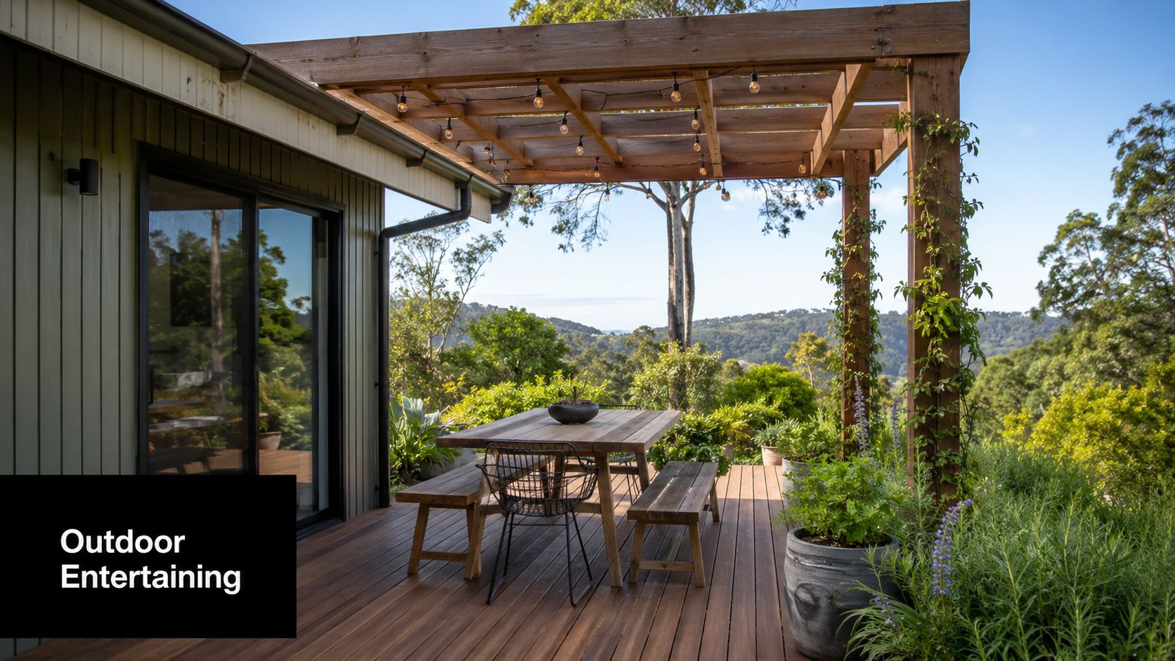
Biophilic design can sound like a trend word, but in practice it means something straightforward. Use natural light, greenery, texture, and materials that make the shop feel calmer and less synthetic.
That matters more than many retailers think. Hard, bright, reflective spaces can feel efficient on paper but uncomfortable in use. People don't always say that directly. They just shorten the visit.
Keep it maintainable
Good biophilic design in retail is restrained. Timber-look finishes, planter integration, softer acoustic surfaces, filtered daylight, and a few well-positioned plants do more than a crowded jungle wall nobody can maintain.
If you're adding greenery, choose species that suit your actual light conditions and staff capacity. A dead plant display hurts the brand faster than no plants at all. This practical guide to selecting office greenery is also useful for retail spaces that need low-fuss indoor planting.
Common wins include a timber slat feature wall behind a service desk, bench seating with integrated planters, and natural-finish shelving in categories where touch and feel help the sale. In wellness, beauty, gifting, and boutique food retail, these details can shift the whole mood of the space without a major footprint change.
8. Showcase Reclaimed and Recycled Materials
If sustainability is part of your brand, let customers see it. Don't hide it in the specification notes.
Reclaimed timber counters, recycled-plastic feature panels, refurbished shelving, repurposed brick, and reused display tables can all become part of the shop story. Done well, they feel intentional rather than improvised. Done badly, they look like leftovers.
The trade-off to manage
Salvaged materials often need more labour than new ones. Timber may require machining, sealing, or straightening. Mixed reclaimed pieces can complicate detailing. Lead times can also be less predictable because availability changes.
That said, visible reuse gives a shop character that off-the-shelf fit-outs rarely have. It also helps smaller brands avoid the polished-but-generic look that makes one tenancy blend into the next.
Use reclaimed materials where they can be appreciated up close:
- Counter fronts: Strong visual impact and easy storytelling.
- Feature walls: Good for texture without interfering with product handling.
- Display plinths and tables: Portable pieces that can move with campaign changes.
If you're exploring these finishes, Templeton Built's guide to eco-friendly building materials is a useful starting point for balancing aesthetics, practicality, and buildability.
One caution. Don't try to make every element sustainable and expressive at once. Pick two or three visible moves and execute them properly.
9. Engineer an Instagrammable Moment
A photogenic feature isn't fluff if it reinforces the brand and earns attention that customers willingly share.
The key is to design one intentional moment, not a shop full of gimmicks. It might be a tiled feature wall in a café-style retail concept, a mirrored try-on nook with flattering lighting, a sculptural product backdrop, or bold signage that frames a purchase ritual. Customers should understand it instantly and use it naturally.
Keep the feature tied to the product
The weakest social-media features are disconnected from what the shop sells. They get photographed, but they don't support the offer. The better version sits beside hero stock, near fitting rooms, or at the handover point where customers already pause.
A few practical rules help:
- Light faces well: If people look washed out or shadowed, they won't share the image.
- Leave standing room: Don't force customers into the main circulation path.
- Avoid fragile finishes: High-touch photo spots get knocked, marked, and scratched.
Retailers sometimes ask whether this is worth giving up display space. Sometimes yes, sometimes no. If the feature strengthens recall, supports gifting, launches, or try-on behaviour, it can justify the footprint. If it's only there to look trendy, it won't last long enough to earn the build cost.
10. Design a Multi-Sensory Fit-out
The strongest stores don't rely on appearance alone. They control how the shop sounds, feels, and in some cases smells.
This doesn't mean turning the space into a theme park. It means making deliberate choices so every sensory cue supports the same brand message. A premium skincare store might use quiet acoustics, warm timber, soft textiles, and a clean scent profile. A youth fashion concept may lean brighter, louder, and more tactile.
Start with the senses that already affect the sale
Touch and sound usually matter before scent. Customers notice harsh reverberation, rattling fixtures, cold materials, sticky handles, and thin curtains in change rooms far sooner than they notice a fragrance diffuser.
In practical fit-out terms, this can include acoustic wall panels disguised as joinery backing, carpet tiles in selected zones, textured handles, heavier fitting-room curtains, softer bench upholstery, and playlist control that changes by time of day. Even the feel of a counter edge or drawer pull contributes to whether the brand feels cheap or considered.
A good multi-sensory fit-out is subtle. Customers may not name each detail, but they'll feel the difference.
This category of shop renovation ideas works best after the basics are right. Fix lighting, flow, and service first. Then layer the sensory details that make the shop easier to remember and nicer to spend time in.
Shop Renovation: 10-Point Comparison
| Strategy | Complexity 🔄 | Resources ⚡ | Expected Outcomes ⭐📊 | Ideal Use Cases 💡 | Key Advantages ⭐ |
|---|---|---|---|---|---|
| 1. Create Experiential Retail Zones | Moderate, modular reconfiguration and tech integration | Medium ($5k–$25k); modular fixtures, screens, seating | 📊 Increased dwell time and average transaction value (case: ~+20% AOV for users) | Boutiques, speciality retailers seeking in-person differentiation | Memorable experiences that boost conversion and repeat visits |
| 2. Develop a High-Impact "Hero" Product Display | Low–Moderate, single focal installation, regular refresh | Low–Medium ($3k–$15k); plinths, spotlights, small screens | 📊 Strong SKU uplift while featured (case: ~+40% sales for featured item) | New launches, high-margin or seasonal hero products | High visual impact with relatively fast ROI |
| 3. Redesign the "Decompression Zone" | Low, remove clutter, improve sightlines | Low ($2k–$10k); low-profile fixtures, flooring/ceiling cues | 📊 Better traffic flow and access to side aisles (case: ~+15% sales in exposed areas) | High-footfall stores needing clearer entry flow | Quick disruption-free improvement to customer circulation |
| 4. Implement a Hybrid Checkout Model | High, joinery, POS integration, staff training | High ($8k–$30k+); tablet POS, strong Wi‑Fi, custom desk | 📊 Reduced queue times and faster conversions (case: ~60% faster checkout) | High-ticket retail, peak-period operations, consultative sales | Faster throughput and personalised on-floor selling opportunities |
| 5. Complete a Full LED Lighting Retrofit | Moderate, specialist design and phased install | Variable ($5k–$40k); LED fixtures, controls, sensors | 📊 Major energy and maintenance savings (up to 80% energy cut; 1–3 yr payback) | Any store with outdated lighting seeking Opex reduction | Lower operating costs plus improved product presentation |
| 6. Upgrade to High-Durability, Low-Maintenance Surfaces | Moderate, flooring/wall replacement, possible short closure | High ($10k–$50k+); LVT, polished concrete, quartz surfaces | 📊 Reduced cleaning/repair costs and downtime (case: significant daily time saved) | High-traffic cafes, grocery, busy retail environments | Long-term Opex savings and improved durability |
| 7. Integrate Biophilic Design Elements | Moderate, planting, timber work, light maximisation | Medium ($4k–$35k); moss walls, timber battens, planters | 📊 Increased dwell time and perceived wellbeing (case: +7 min dwell) | Wellness, lifestyle, and boutique brands focused on ambience | Calming environment that enhances brand sustainability image |
| 8. Showcase Reclaimed and Recycled Materials | Moderate–High, sourcing and custom fabrication | Medium–High ($7k–$40k); reclaimed timber, recycled panels, custom metalwork | 📊 Strong brand storytelling and social engagement | Eco-conscious brands and stores seeking authentic differentiation | Visible sustainability message and unique aesthetic appeal |
| 9. Engineer an "Instagrammable" Moment | Low, focused visual feature and lighting | Low ($3k–$12k); neon/signage, mural, integrated lighting | 📊 UGC and social-driven foot traffic uplift | Beauty, F&B, lifestyle stores targeting social shareability | Built-in free marketing via customer photo-sharing |
| 10. Design a Multi-Sensory Fit-out | High, integrated scent, audio, material selection | High ($10k–$50k+); scent diffusers, multi-zone audio, premium materials | 📊 Stronger brand memory and perceived value; supports premium pricing | Luxury retail, experiential flagship stores | Deep differentiation through immersive, multi-sensory branding |
Your Next Step From Ideas to Action Plan
A shop fit-out usually goes off course before demolition starts. The owner wants a fresher look. Staff want a better counter. The landlord wants drawings. Then the budget gets spread across ten decent ideas instead of two changes that would actually improve sales, speed, or operating costs.
Start with the business result, then choose the renovation. If the priority is higher basket size, put money into the areas customers notice first and remember most, such as the decompression zone, hero product display, and experiential touchpoints. If the problem is queueing, slow service, or labour drag, focus on checkout layout, circulation, and back-of-house support. If margin pressure is the issue, the stronger spend is usually LED lighting, hard-wearing finishes, and upgrades that cut maintenance callouts.
This is the filter I use on live projects. Every item in the brief should answer one question clearly. What commercial problem is this solving?
Retailers often lose money by approving attractive finishes before fixing the floor plan. A new counter does not help if customers still queue across the entry. Premium flooring does not improve conversion if people walk in and fail to orient themselves in the first few seconds. Good renovation planning ranks work by return, installation difficulty, and how much trading disruption the site can absorb.
As noted earlier, Australia has a large renovation and supply market, which gives retailers solid access to trades, fixtures, and replacement materials. That helps with staged works, after-hours installation, and faster procurement, but only if the scope is documented properly and lead times are checked early. Imported joinery hardware, custom glazing, signage approvals, and switchboard upgrades can still slow a project down.
For Adelaide retailers, local conditions matter. Heat changes the value of lighting efficiency, glazing performance, and air movement. Older strips and heritage frontages can limit façade changes. Shopping centres may restrict delivery windows, noisy works, hoarding, and access to services. Small tenancies also leave less room for stock swings during construction, so sequencing matters more than many owners expect.
Choose a builder who talks about downtime, maintenance, and payback, not just finishes. They should ask where staff lose time, which categories drive margin, how customers move through the store, what work can happen after hours, and which materials will still present well after years of trolley traffic, prams, wet weather, or daily cleaning. They should also push back on ideas that photograph well but perform poorly on the floor.
Security should be part of that conversation early, especially if the renovation changes sightlines, service counters, or high-value display placement. For businesses reviewing that risk during a refurbishment, practical steps for preventing retail shrinkage can inform the brief before drawings are locked in.
If you're planning a retail upgrade in Adelaide, Templeton Built can help turn early concepts into a practical renovation plan that respects budget, minimises downtime, and delivers a shop that works harder every trading day.


Leave a Reply